Digital accessibility
Digital accessibility is on people’s minds more than ever with the ADA Title II Digital Accessibility deadline of 24 April 2026 quickly approaching. But even without this looming deadline, the principles of Universal Design for Learning and our desire to make our work accessible to as many people as possible, provides ample reasons to think about accessibility when producing any kind of documents for consumption but especially digital documents.
General resources
- A good place to start is with the resources on digital accessibility created by TLOS (Technology-enhanced learning and online strategies).
- The World Wide Web Consortium’s Web Accessibility Initiative provides a plethora of resources for what web accessibility entails, the different standards—such as Web Content Accessibility Guidelines (WCAG) 2.1, and lists of tools to test your content.
- Another useful resource is the Web Accessibility in Mind (WebAIM).
Tools for testing websites
Two tools that will provide you with a good start to ensuring your pages are accessible are WAVE and Axe DevTools.
- WAVE - Web accessibility evaluation tool is a website where you can paste in a url and run a check on the website.
- Axe DevTools is a Google Chrome extension that you can access through the Developer menu in Chrome. One benefit of Axe DevTools is that you can run the checker on a local preview of your website by opening that preview in Chrome.
- Chrome also has its own accessibility pane in its developer tools.
- In addition, there are some fairly simple tools built into Quarto to use Axe to check for accessibility issues on individual pages.
Two issues that are prominent in making websites more accessible is ensuring adequate color contrast and writing alternative text for images so that they can be understood by people using screen readers.
Color contrast
All of the above tools will point out issues with color contrast and whether contrast levels pass the WCAG 2.1 standard. WebAIM’s color contrast tool is a good general purpose tool for testing out color contrast.
Color contrast and accounting for different forms of colorblindness is important when building visualizations. See the resources page on creating accessible plots with ggplot2.
Alternative text
Alternative text is a brief description of images that is accessible to screen readers, making your content accessible to low sight readers. Alt text should describe the text within the context in which the image appears. Here are some dos and don’ts with alt text:
Dos
- Alt text should describe the “why” of an image—its core function/purpose/information.
- Choose what to describe by:
- Identifying why the image was included or what readers are meant to learn from the image.
- Moving from larger to smaller details.
- Alt text should be written in a similar voice/style to the rest of the text.
- Alt text should be as short as possible to explain the image.
- If there is text in an image, it should be included in the alt text.
- Make sure that every sentence ends with a period/proper punctuation.
- Alt text should illustrate any clear patterns made by data visualizations (e.g., a data point that is significantly different from the rest or important within the context).
Don’ts
- Do not repeat information about the image included in the body text or caption.
- Do not include information in alt text that is not part of the image.
- Do not use phrases like “picture of” or “image of.”
- Exception: if the type of image is important to the context (i.e., logo, illustration, painting, cartoon).
Some resources on alt text
Alt text in Quarto
Images
The basics of working with images and providing alternative text are shown below. If you want to do more with images, including sizing and arranging, see the Quarto documentation on Figures. You may also want to look at the Lightbox figures documentation for another tool for working with images.
- Images in Quarto use the Markdown syntax of:
.
- Add a caption by placing text within the square brackets:
.
- Add alt text with the
fig-altattribute to the image:{fig-alt="This is alt text."}
The following code will produce the following image if you have a folder named img with images in it:
{fig-alt="Cartoon of Chinstrap, Gentoo, and Adélie penguins with color splashes behind them."}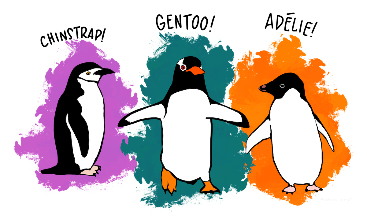
Plots
You can also add alt text and captions to plots you make using R within a Quarto document. If you create a plot in R and then save it as an image file, which you then use on your website, use the process above of placing an image in the text.
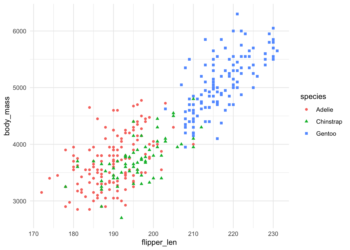
To provide alt text for a plot, use the same fig-alt attribute but this time as a chunk option. For instance:
#| fig-cap: "The flipper length compared to the body mass of Palmer Penguins."
#| fig-alt: |
#|   The plot shows flipper length on the x-axis, with values that range from
#|   170 to 230, and body mass on the y-axis, with values that range from 3000
#|   to 6000. The three species are displayed using different colors and shapes.
#|   Adélie and Chinstrap are of similar size, while Gentoo are both heavier and
#|   have longer flippers.

ggplot(data = penguins,
       mapping = aes(x = flipper_len, y = body_mass)) +
  geom_point(mapping = aes(color = species, shape = species)) +
  theme_minimal()