This page provides an introduction to network analysis in R. It provides a very short overview of the main concepts of network analysis, the structure of network data, and then introduces the packages for working with network data and visualizing it using ggplot2.
Network analysis concepts
Networks are made up of entities and connections between those entities. The vocabulary around these concepts differs based on software and discipline, but the entities are referred to as nodes or vertices and the connections are referred to as edges or links. A collection of nodes and edges make up a graph whether it is visualized or not.
There are a variety of terms to characterize a graph or to understand aspects about the nodes and edges that constitute a graph.
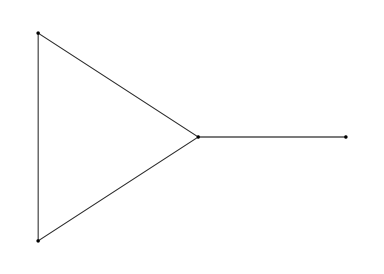
Five number summary
The basic structures of a graph can be defined though these five summaries.
Size: number of nodes
Density: (0–1) proportion of observed ties to possible ties.
Components: subgroup in which all nodes are connected.
Diameter: longest of the shortest paths across all pairs of nodes.
Cluster: (0–1) proportion of closed triangles to the total number of open and closed triangles.
Graph terms and measurements
Directed: Whether the order of node pairs represents flow of the connection. Graphs can be directed or undirected.
Neighbors: Two nodes are adjacent and neighbors if joined by an edge.
Degree: number of edges connected to the node.
Walk: distance between nodes.
Path: a walk without repeated nodes or edges.
Distance: shortest path between nodes.
Centrality: measurement of the importance of a node within a graph. There are three main types of centrality measurements.
Closeness centrality: closeness is inversely related to the total distance of a node to all other nodes.
Betweenness centrality: related to the position of the node on paths between other nodes. If many paths go through a node it has a high centrality.
Eigenvector centrality: focuses on prestige or rank. It uses neighbors to find centrality.
Network data structure
Network data is different from other types of data we have encountered because it is made up of two related structure: an edge list and a node list.1 Within R these two data structures are represented by data frames:
Edge list: A data frame with at least two columns of the node pairs that are joined by an edge. These columns are often named from and to even if there is no direction for the connection. Further columns provide attributes for the edges such as weight, count, or type.
Node list: A data frame with at least one column containing all of the unique nodes in the graph. This column is often named id. Further columns provide attributes for the node such as name, type, etc.
Let’s look at a simple example:
library(tidyverse)# Data frame of node pairstibble(from =c(1, 2, 2, 3, 4),to =c(2, 3, 4, 2, 1))
# A tibble: 5 × 2
   from    to
  <dbl> <dbl>
1     1     2
2     2     3
3     2     4
4     3     2
5     4     1
# Data frame of nodestibble(id =1:4)
# A tibble: 4 × 1
     id
  <int>
1     1
2     2
3     3
4     4
A more complex graph might have attributes for edges and nodes.
# A tibble: 5 × 3
   from    to type
  <dbl> <dbl> <chr>
1     1     2 History
2     2     3 English
3     2     4 Art History
4     3     2 History
5     4     1 English
# Data frame of nodesnode_list <-tibble(id =1:4,name = LETTERS[1:4],university =c("VT", "JMU", "UVA", "GMU"))node_list
# A tibble: 4 × 3
     id name  university
  <int> <chr> <chr>
1     1 A     VT
2     2 B     JMU
3     3 C     UVA
4     4 D     GMU
There are other ways to represent network data, but node and edge lists provides a solid foundation for working with network data. There may be hundreds of thousands of nodes or edges and dozens of attributes, but at its foundation, network data is node pairs and a set of unique nodes.
Packages for network analysis in R
We will be using three main packages for network analysis in R, though there are many more you can explore in CRAN network analysis task view.
igraph an R package for working with network data.
tidygraph a tidy API for graph/network manipulation.
ggraph an extension of ggplot2 aimed at supporting network graphs.
netrankr: Implementation or various centrality measures.
igraph will provide the network algorithms, but we will access these through the tidygraph package that integrates with the tidyverse. Finally, ggraph provides extensions to ggplot2 to integrate the visualization of network graphs.
Creating network objects
Let’s start by loading the packages listed above.
library(igraph)library(tidygraph)library(ggraph)
There are two ways to turn the edge list and node list into a network object. We can either go directly to a tbl_graph object from tidygraph using the tbl_graph() function or first create an igraph object using graph_from_data_frame(). I have found that with larger graphs graph_from_data_frame() works more consistently. Both methods are shown below.
# Create a tbl_graph with tidygraphtbl_graph(nodes = node_list, edges = edge_list, directed =FALSE)
# A tbl_graph: 4 nodes and 5 edges
#
# An undirected multigraph with 1 component
#
# Node Data: 4 × 3 (active)
     id name  university
  <int> <chr> <chr>
1     1 A     VT
2     2 B     JMU
3     3 C     UVA
4     4 D     GMU
#
# Edge Data: 5 × 3
   from    to type
  <int> <int> <chr>
1     1     2 History
2     2     3 English
3     2     4 Art History
# ℹ 2 more rows
IGRAPH 198f26f UN-- 4 5 --
+ attr: name (v/c), university (v/c), type (e/c)
+ edges from 198f26f (vertex names):
[1] A--B B--C B--D B--C A--D
You will notice that the way these objects print to the console are quite different. A tbl_graph object prints out as two data frames for the nodes and edges. An igraph object provides an overview of the graph, including the number of nodes and edges. It lists the attributes of the data attr, and then provides a graphical overview of the edge list. Let’s create a variable by first making an igraph object and then converting to tbl_graph.
# A tbl_graph: 4 nodes and 5 edges
#
# An undirected multigraph with 1 component
#
# Node Data: 4 × 2 (active)
  name  university
  <chr> <chr>
1 A     VT
2 B     JMU
3 C     UVA
4 D     GMU
#
# Edge Data: 5 × 3
   from    to type
  <int> <int> <chr>
1     1     2 History
2     2     3 English
3     2     4 Art History
# ℹ 2 more rows
Summary of the graph
Let’s get our five number summary of this graph using igraph functions.
# 1. Sizegorder(network)
[1] 4
# 2. Density (0-1)edge_density(network)
[1] 0.8333333
# 3. Components: only one, all nodes have at least one edgecomponents(network)
$membership
A B C D
1 1 1 1

$csize
[1] 4

$no
[1] 1
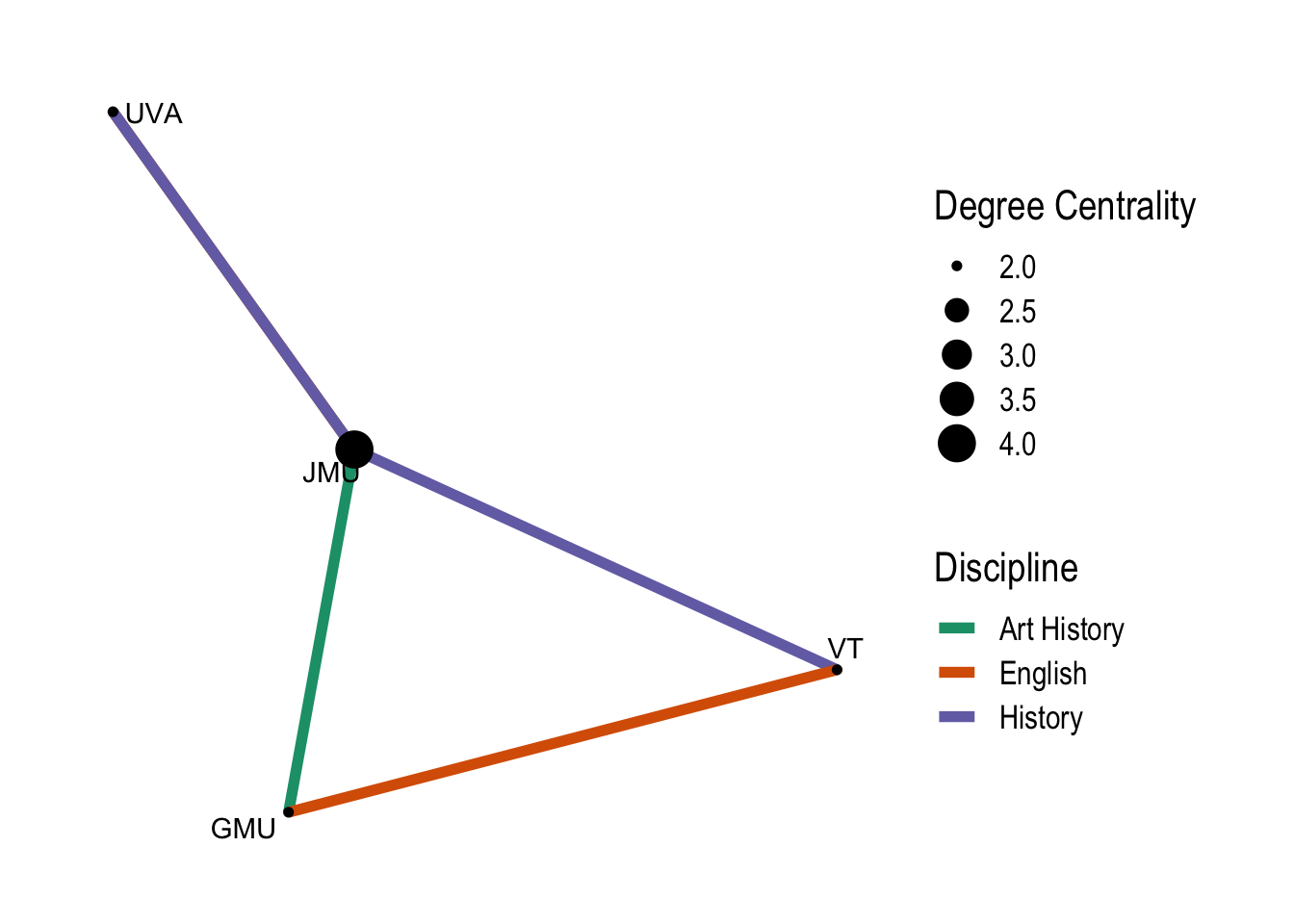
Let’s make a calculation of the centrality of the nodes using dplyr methods. centrality_degree() measure the degrees and strength of nodes within the graph.
network |>mutate(centrality =centrality_degree())
# A tbl_graph: 4 nodes and 5 edges
#
# An undirected multigraph with 1 component
#
# Node Data: 4 × 3 (active)
  name  university centrality
  <chr> <chr>           <dbl>
1 A     VT                  2
2 B     JMU                 4
3 C     UVA                 2
4 D     GMU                 2
#
# Edge Data: 5 × 3
   from    to type
  <int> <int> <chr>
1     1     2 History
2     2     3 English
3     2     4 Art History
# ℹ 2 more rows
You can see that a new attribute column has been created and the most central node according to this calculation is B from JMU. There are many more calculations you can make to understand the nature of the nodes and edges in a graph. Check the igraph and tidygraph documentation for possibilities.
Note that by default dplyr functions will work on the nodes data frame. To alter the edges data frame activate it with the activate() function.
# A tbl_graph: 4 nodes and 2 edges
#
# An unrooted forest with 2 trees
#
# Edge Data: 2 × 3 (active)
   from    to type
  <int> <int> <chr>
1     1     2 History
2     2     3 History
#
# Node Data: 4 × 2
  name  university
  <chr> <chr>
1 A     VT
2 B     JMU
3 C     UVA
# ℹ 1 more row
Visualize the graph
Finally, let’s visualize the graph with ggraph. ggraph adds node and edge geoms to ggplot2 and implements a graph style that removes the x and y grid. This is because the question of where to layout nodes on an x-y plane is one of the more complex problems in network analysis and a number of algorithms have been developed to do this. Instead of using ggplot() a graph visualization is begun with ggraph().2
There are different styles for the shape of the edges and many different layouts. You can also use any of the layouts from igraph. Let’s finish this up by adding some additional information from the attribute data. This shows that ggraph implements scales for edges allowing you to have to scales of the same type for edge and node.
Even this very simple graph visualization with made up data shows something about the connections. If you want to experiment with real historical data, try it out with the SNiGB data.
Ruth Ahnert et al., The Network Turn: Changing Perspectives in the Humanities (Cambridge University Press, 2020), https://doi.org/10.1017/9781108866804.
Mark Granovetter, “The Strength of Weak Ties,” American Journal of Sociology 78, no. 6 (1973): 1360–80, http://www.jstor.org/stable/2776392.
Florian Kerschbaumer et al., eds., The Power of Networks: Prospects of Historical Network Research (Routledge, 2020), https://doi.org/10.4324/9781315189062.