library(patchwork)
library(tidyverse)
library(ggtext)
library(glue)

# Data
bikes <- readr::read_csv(
  here::here("data", "london-bikes-custom.csv"),
  col_types = "Dcfffilllddddc"
)

bikes$season <- forcats::fct_inorder(bikes$season)
bikes_sorted <- bikes  |>
  filter(!is.na(weather_type)) |>
  group_by(weather_type) |>
  mutate(sum = sum(count)) |>
  ungroup() |>
  mutate(
    weather_type = forcats::fct_reorder(
      str_to_title(str_wrap(weather_type, 5)), sum
    )
)24 patchwork
patchwork makes it simple to combine separate ggplots into the same graphic.
Source: Cédric Scherer, Graphic Design with ggplot2 at RStudio conf 2022. All examples are derived from this workshop.
24.1 Patchwork functions
24.1.1 Composing plots
-
+: Add plots in row order -
|: Place plots beside each other -
-: Used to keep each side from each other when building complex plots -
/: Place plots on top of each other -
&: Apply elements to all subplots in the composition -
*: Apply elements to all subplots in the current nesting level- Using
+to add elements of a plot will affect the last plot
- Using
-
(): Use parentheses to group plots
24.1.2 Composing plots with functions
-
wrap_plots(): Provides a functional way to construct plot -
inset_element(): Add inset graphics -
plot_spacer(): Add an empty element to a composition.
24.1.3 Layout specifications
-
plot_layout(): Adjust the layout, widths and heights - Use text layouts to create custom layouts
-
plot_annotation(): Add tags and general labels`
24.2 Setup
24.2.1 Make the plots
Code
# Theme
theme_std <- theme_set(theme_minimal(base_size = 18))
theme_update(
  panel.grid = element_blank(),
  axis.text = element_text(color = "grey50", size = 12),
  axis.title = element_text(color = "grey40", face = "bold"),
  axis.title.x = element_text(margin = margin(t = 12)),
  axis.title.y = element_text(margin = margin(r = 12)),
  axis.line = element_line(color = "grey80", linewidth = 0.4),
  legend.text = element_text(color = "grey50", size = 12),
  plot.tag = element_text(size = 40, margin = margin(b = 15)),
  plot.background = element_rect(fill = "white", color = "white")
)

p1 <- ggplot(
    bikes_sorted,
    aes(x = weather_type, y = count, color = weather_type)
  ) +
  geom_hline(yintercept = 0, color = "grey80", size = .4) +
  stat_summary(
    geom = "point", fun = "sum", size = 12
  ) +
  stat_summary(
    geom = "linerange", ymin = 0, fun.max = function(y) sum(y),
    linewidth = 2, show.legend = FALSE
  ) +
  coord_flip(ylim = c(0, NA), clip = "off") +
  scale_y_continuous(
    expand = c(0, 0), limits = c(0, 8500000),
    labels = scales::comma_format(scale = .0001, suffix = "K")
  ) +
  scale_color_viridis_d(
    option = "magma", direction = -1, begin = .1, end = .9, name = NULL,
    guide = guide_legend(override.aes = list(size = 7))
  ) +
  labs(
    x = NULL, y = "Sum of reported bike shares", tag = "P1",
  ) +
  theme(
    axis.line.y = element_blank(),
    axis.text.y = element_text(color = "grey50", face = "bold",
                               margin = margin(r = 15), lineheight = .9)
  )
#> Warning: Using `size` aesthetic for lines was deprecated in ggplot2 3.4.0.
#> ℹ Please use `linewidth` instead.

p2 <- bikes_sorted |>
  filter(season == "winter", is_weekend == TRUE, day_night == "night") |>
  group_by(weather_type, .drop = FALSE) |>
  mutate(id = row_number()) |>
  ggplot(
      aes(x = weather_type, y = id, color = weather_type)
    ) +
    geom_point(size = 4.5) +
    scale_color_viridis_d(
      option = "magma", direction = -1, begin = .1, end = .9, name = NULL,
      guide = guide_legend(override.aes = list(size = 7))
    ) +
    labs(
      x = NULL, y = "Reported bike shares on\nweekend winter nights", tag = "P2",
    ) +
    coord_cartesian(ylim = c(0.5, NA), clip = "off")

my_colors <- c("#cc0000", "#000080")

p3 <- bikes |>
  group_by(week = lubridate::week(date), day_night, year) |>
  summarize(count = sum(count), .groups = "drop_last") |>
  mutate(avg = mean(count)) |>
  ggplot(aes(x = week, y = count,
             group = interaction(day_night, year))) +
    geom_line(color = "grey65", linewidth = 1) +
    geom_line(aes(y = avg, color = day_night), stat = "unique", linewidth = 1.7) +
    annotate(
      geom = "text", label = c("Day", "Night"), color = my_colors,
      x = c(5, 18), y = c(125000, 29000),
      size = 8, fontface = "bold",
    ) +
    scale_x_continuous(breaks = c(1, 1:10*5)) +
    scale_y_continuous(labels = scales::comma_format()) +
    scale_color_manual(values = my_colors, guide = "none") +
    labs(
      x = "Week of the Year", y = "Reported bike shares\n(cumulative # per week)", tag = "P3",
    )
24.3 Composing plots
(p1 + p2) / p3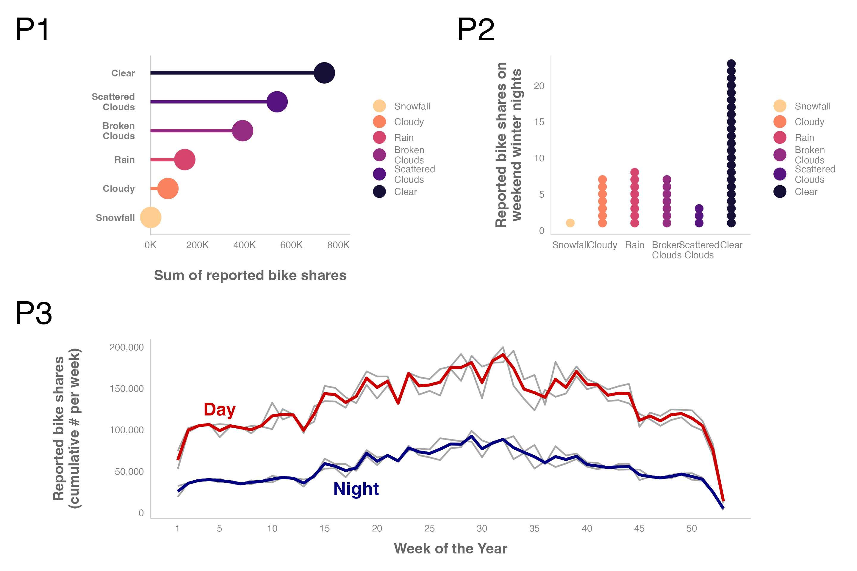
Collect the legends and place them on the composed plot. Note that the theme() is added with & to apply the theme to all subplots in the composition. Use * to apply elements to all subplots in the current nesting level. Use + to add element to the previous plot.
((p1 + p2) / p3 & theme(legend.justification = "top")) +
  plot_layout(guides = "collect")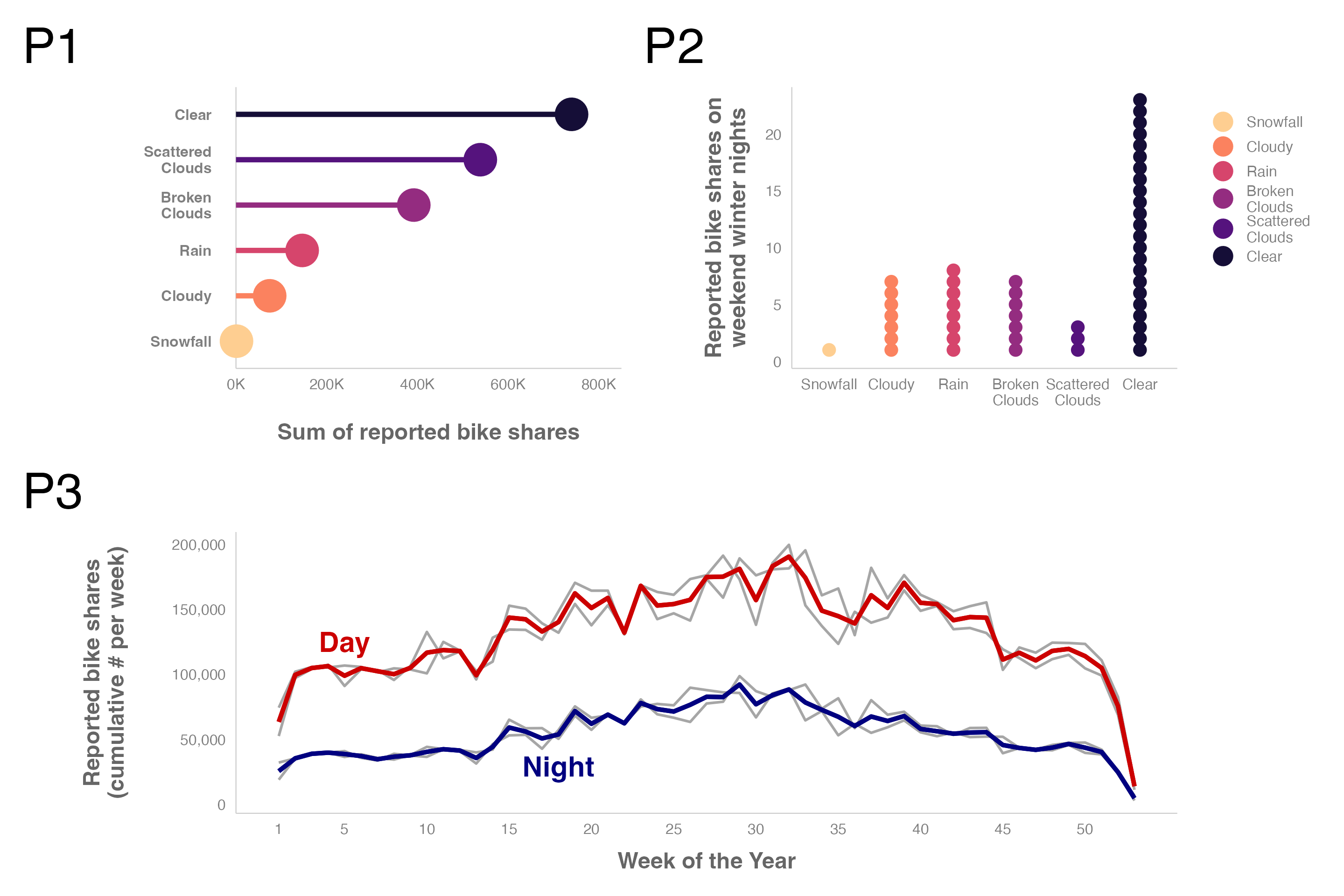
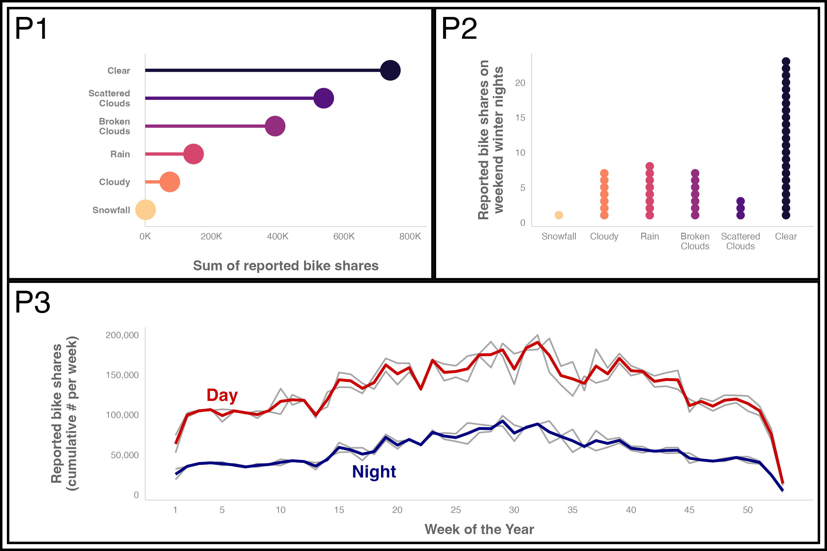
You can apply a theme to all the plots using & theme().
(p1 + p2) / p3 &
  theme(legend.position = "none",
        plot.background = element_rect(color = "black",
                                       linewidth = 3)
        )
To adjust the theme of the patchwork composition itself, such as modifying a title, use the theme argument in plot_annotation(). You can also use plot_annotation() to provide tags to the subplots.
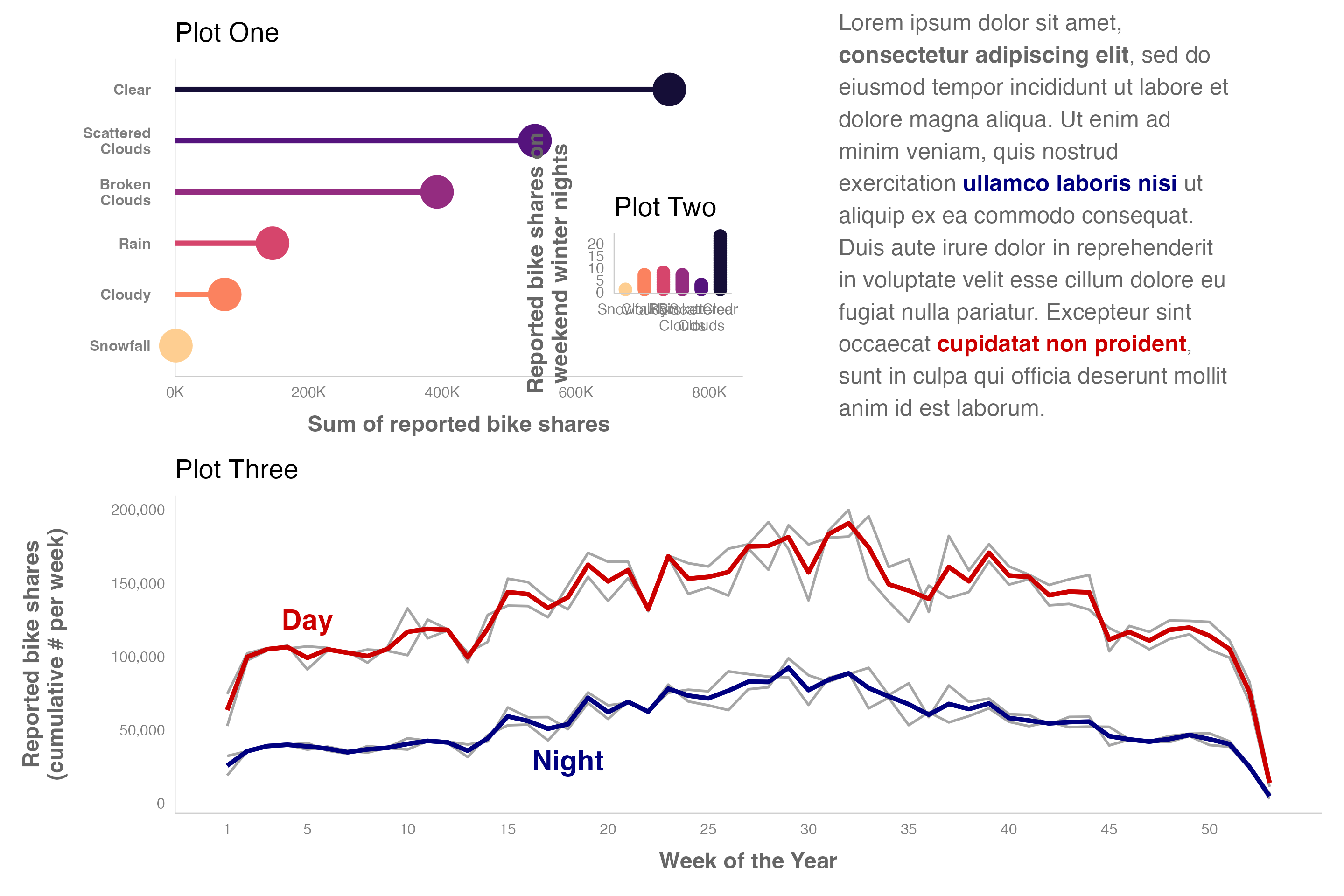
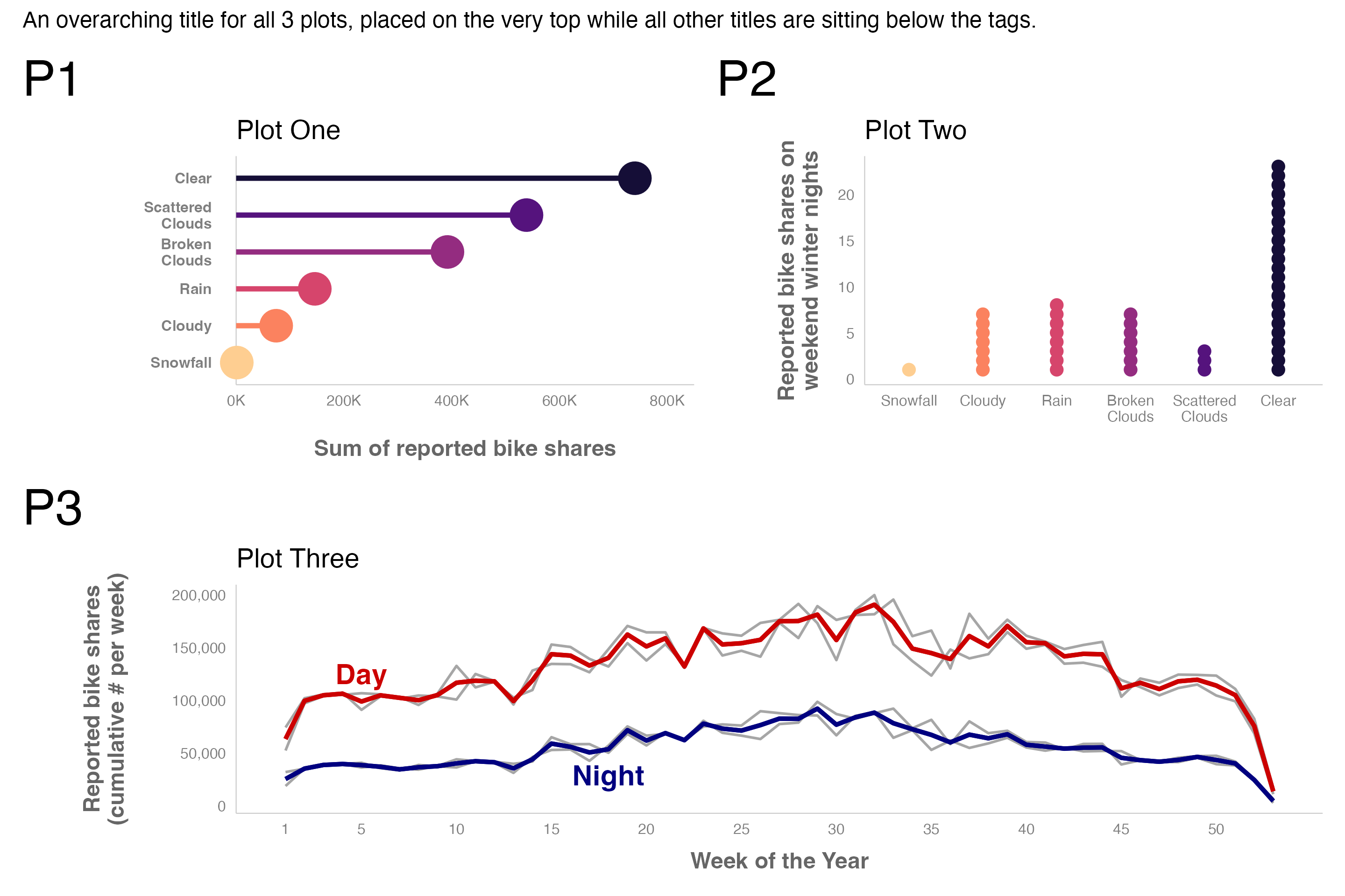
# Add titles to plots
pl1 <- p1 + labs(tag = NULL, title = "Plot One") +
  theme(legend.position = "none")
pl2 <- p2 + labs(tag = NULL, title = "Plot Two") +
  theme(legend.position = "none")
pl3 <- p3 + labs(tag = NULL, title = "Plot Three") +
  theme(legend.position = "none")

(pl1 + pl2) / pl3 +
  plot_annotation(
    tag_levels = "1", tag_prefix = "P",
    title = "An overarching title for all 3 plots, placed on the very top while all other titles are sitting below the tags.",
    theme = theme(plot.title = element_text(size = 18))
    )
24.4 Laying out plots
See the Controlling Layouts vignette.
Adjust the widths and heights with plot_layout() using the widths and heights arguments to provide the relative widths and heights of each column and row in the grid.
((p1 + p2) / p3 & theme(legend.position = "none")) +
  plot_layout(heights = c(2, 1), widths = c(2, 1))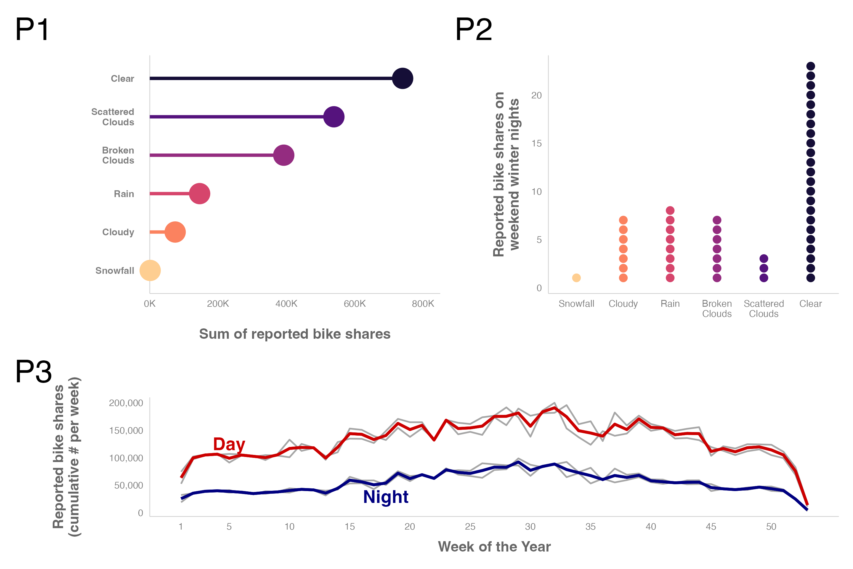
You can create a custom layout with a textual representation. # represents an empty area. Each plot is then represented by a capital letter in alphabetical order. Another way to do this is with the area() function, but textual representation gives options for many layouts.
picasso <- "
AAAAAA#BBBB
CCCCCCCCC##
CCCCCCCCC##"

(p1 + p2 + p3 & theme(legend.position = "none")) +
  plot_layout(design = picasso)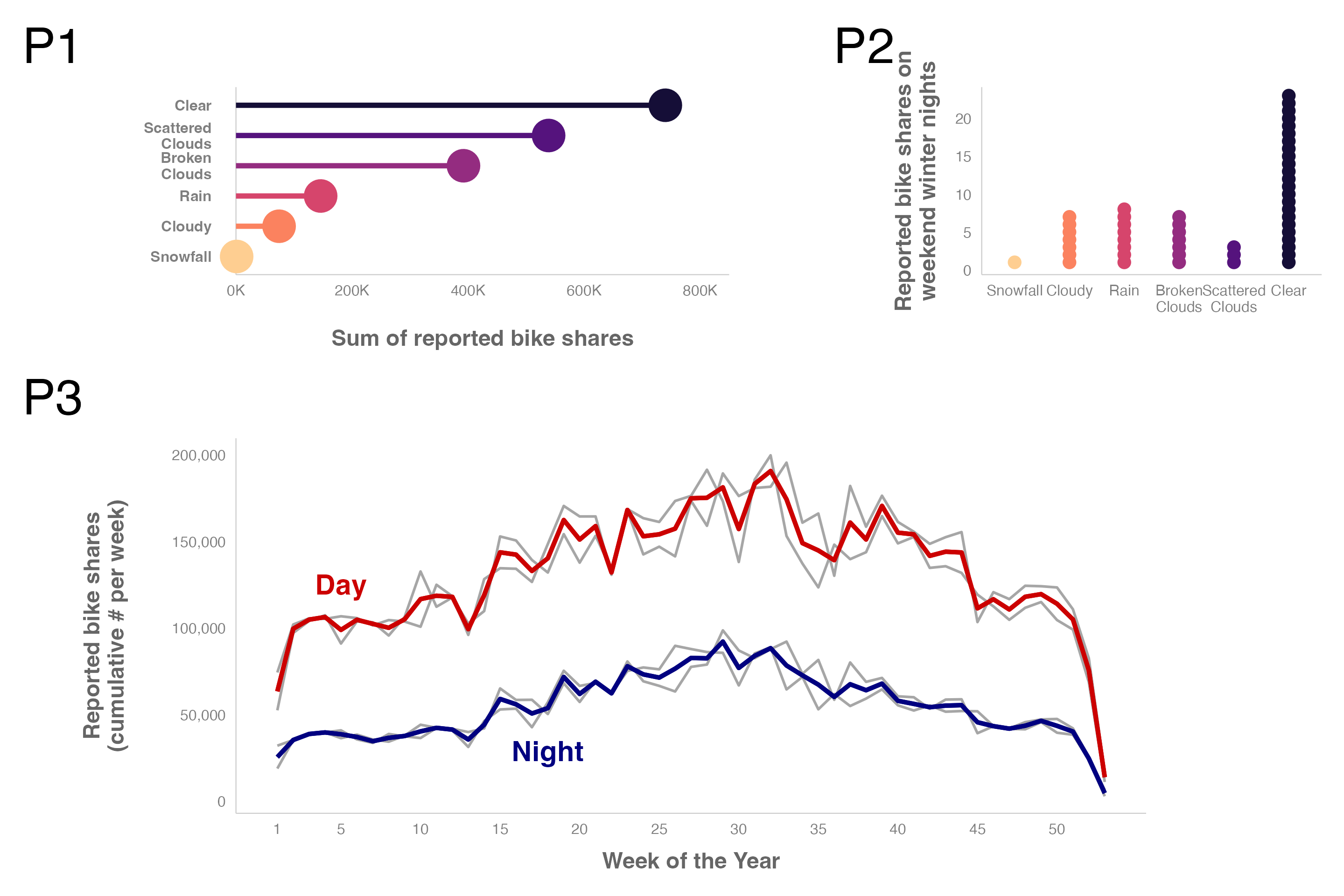
24.5 Inserting elements
You can also add a plot of text with ggtext to add text directly to a composition, see the section on Insets in the Controlling Layouts vignette.
text <- tibble(
  x = 0, y = 0,
  label = glue(
    "Lorem ipsum dolor sit amet, **consectetur adipiscing elit**, ",
    "sed do eiusmod tempor incididunt ut labore et dolore magna ",
    "aliqua. Ut enim ad minim veniam, quis nostrud exercitation ",
    "<b style='color:#000080;'>ullamco laboris nisi</b> ut aliquip ",
    "ex ea commodo consequat. Duis aute irure dolor in reprehenderit ",
    "in voluptate velit esse cillum dolore eu fugiat nulla pariatur. ",
    "Excepteur sint occaecat <b style='color:#cc0000;'>cupidatat non ",
    "proident</b>, sunt in culpa qui officia deserunt mollit anim id ",
    "est laborum."
    )
)

pt <- ggplot(text, aes(x = x, y = y)) +
  ggtext::geom_textbox(
    aes(label = label),
    box.color = NA, width = unit(23, "lines"),
    color = "grey40", size = 6.5, lineheight = 1.4
  ) +
  coord_cartesian(expand = FALSE, clip = "off") +
  theme_void()

(p1 + pt) / p3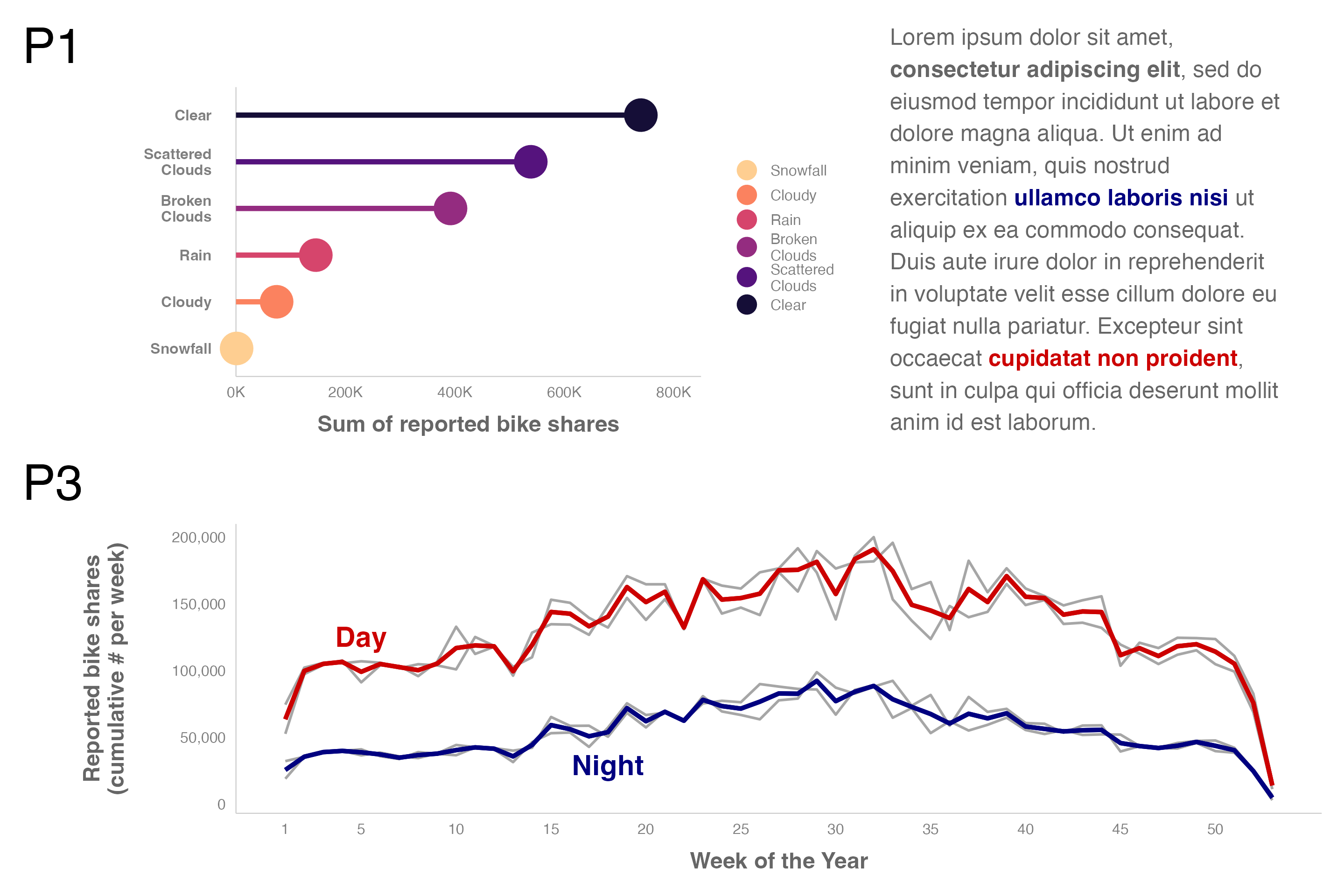
Add inset plots with inset_element()
pl1 + inset_element(pl2, l = .6, b = .1, r = 1, t = .6)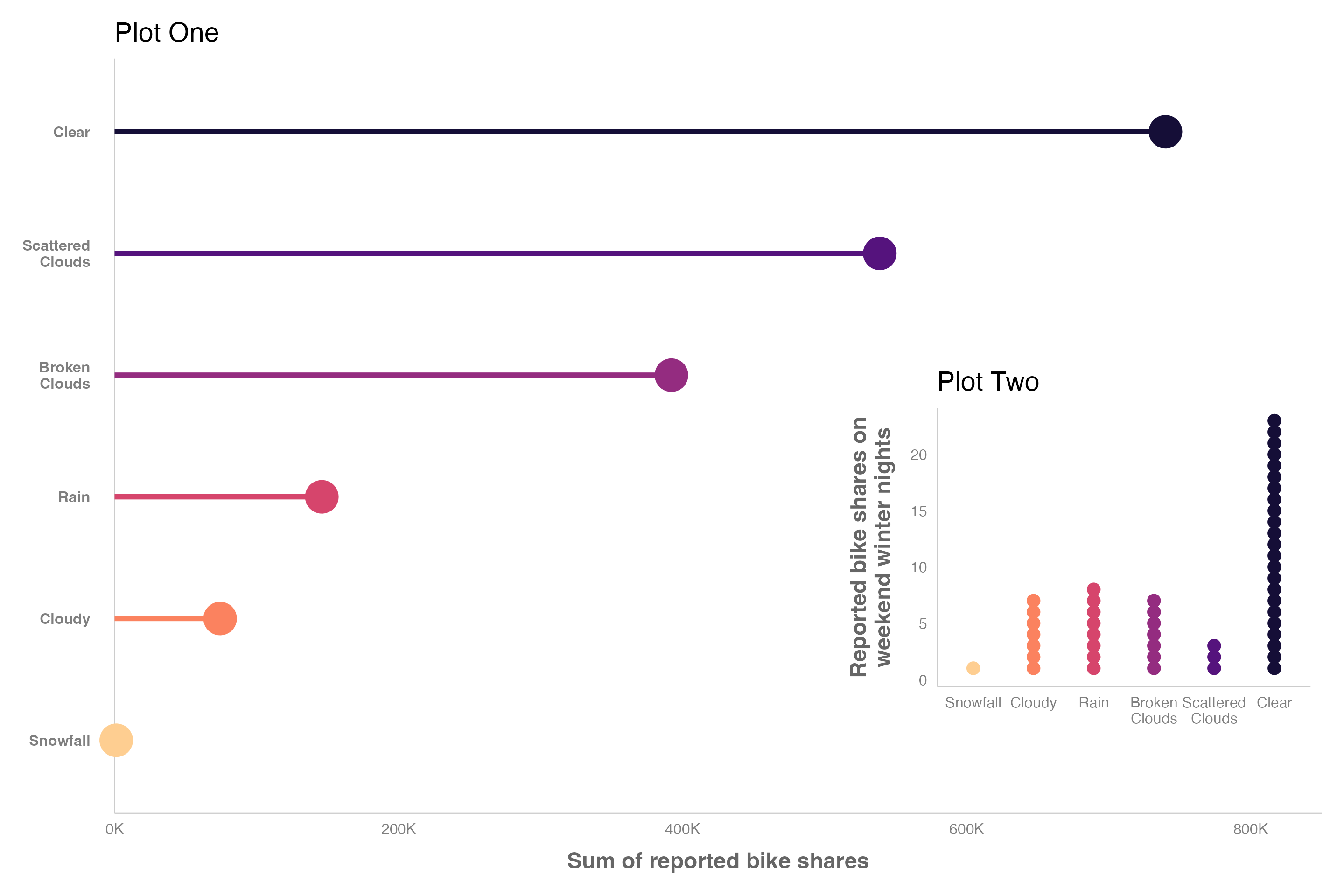
Plots with insets can be added to larger compositions.
(pl1 + inset_element(pl2, l = .6, b = .1, r = 1, t = .6) + pt) / pl3